My Melbourne home
Leaving a cramped London apartment and moving to Melbourne was a dream for my partner, Nick Young and I. When it came to buying a property, we were tempted by a warehouse conversion in an industrial part of town, but the lure of the sea won us over and we fell for this cool 1950’s beach house in bayside Melbourne. I remember viewing the house with the estate agent, then going for a coffee at a local beach café and catching a glimpse of dolphins out at sea - it felt like a sign that this was the one. The house was in a quiet street, in a friendly neighbourhood, and best of all, just a 10 minute walk to the beach. We loved the 50’s retro style, with a skillion roof and simple, open plan layout spilling out on to a leafy back garden. We gradually stamped our style on the house, with bold wallpaper and mid-century furniture.
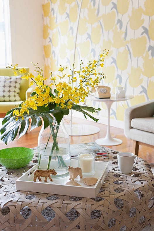
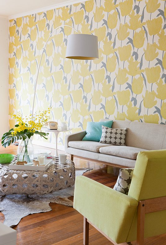
My woven Globewest coffee table brings a beachy vibe to the sitting room which I’ve styled with a sweet arrangement of wooden animal ornaments and a lime green paper mâché African bowl. The display of sunny yellow Dancing Lady orchids and huge Monstera leaves adds to the tropical feel.
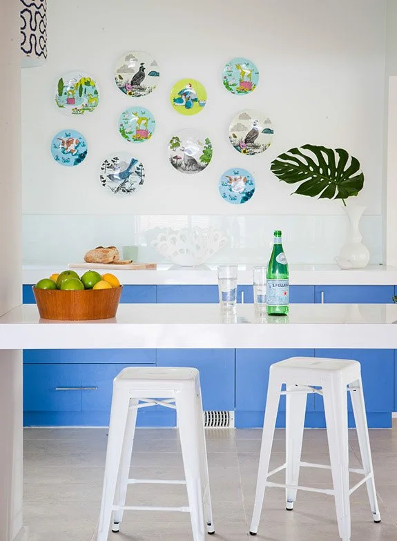
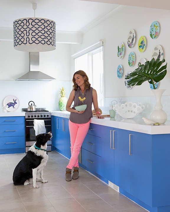
Previously this area, that links the kitchen to the sitting room, had been partially blocked in by an ugly built-in bar area, but we opened it up to create an extra seating area, which also enhanced the sense of flow. I hung my collection of Mozi melamine plates on the wall to add a splash of fun and colour. I love how these cheerful plates, depicting goats, cows, pheasants, rabbits and birds, bring such charm and character to the space. I met founders of Aussie brand, Mozi - sisters, Camilla and Olivia Tipler - at their studio when they were first starting out, and would often catch up with them at trade shows over the years, so I love having these plates as a reminder of those days.
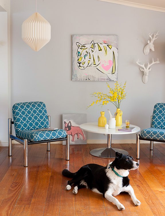
This living and meals area flows off the kitchen and out on to the leafy back garden. I’ve created a cosy seating here with a contemporary Freedom coffee table and two upcycled 1960’s lounge chairs which I picked up at Camberwell Sunday market in Melbourne. Previously covered in an orange vinyl, I had them recovered in this cool Moroccan geometric fabric from Mokum Textiles. I painted the walls in a soft dove grey which sets off Nicks stylised snow leopard painting, white resin deer heads and a sculptural paper pendant from Safari Living in Melbourne. Jack, our border collie managed to sat still for long enough for photographer Dan Magree to capture the moment.
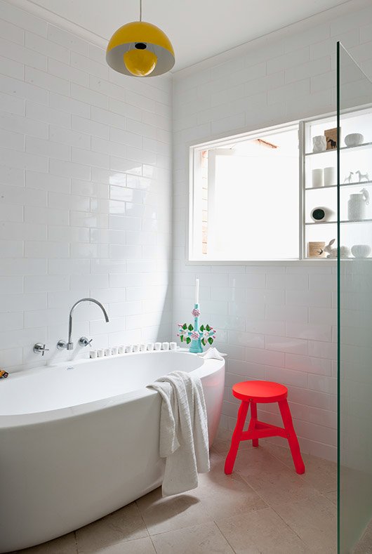
We completely gutted the bathroom and I kept the new design simple with utilitarian white brick tiles covering the walls. I reconfigured the room, moving the basin from the window wall to the opposite side, as spatially, it made more sense. The beautiful simplicity of the egg shaped bath enhances the space and adds a sculptural element. I chose the crossed shaped, wall mounted taps to tie in with the cool, modern vibe. A Verner Panton Flowerpot VP1 pendant light brings the all important pop of colour. I opted for stone effect ceramic tiles in natural taupe tones for the floor and designed a wet shower area.
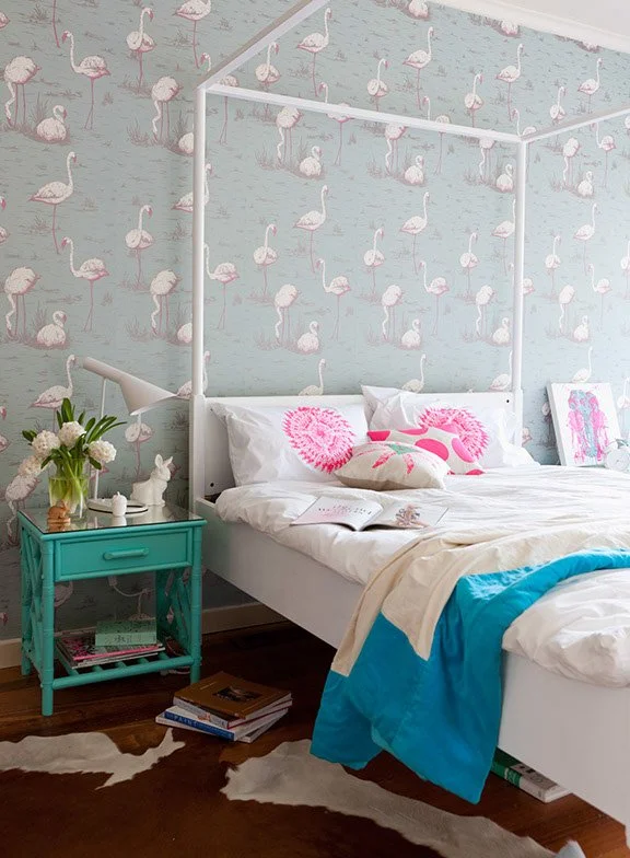
This fun Flamingos wallpaper, one of Cole & Sons most loved designs, adds a whimsical feel to my bedroom and creates a colourful backdrop for my four-poster bed. I’ve added some bright pops of pink to tie in with the pink tones in the wallpaper. The pillowcases, cushions and artwork were all designed, and hand printed by Nick and I in our studio. The upcycled bedside table was an op shop find, and originally a dark forest green. I transformed it with a lick of mint coloured paint and a reflective, mirrored glass top.
Thank you to our friend, photographer Dan Magree for capturing these beautiful images, which we will treasure forever.
When designing a room scheme, my starting point is often a wallpaper or fabric and everything else flows from that. I fell in love with this exuberant ‘Jewel of Spring’ wallpaper from the Hothouse Collection designed by Suzie Hoodless for Osborne & Little and decided to paper the main wall in my sitting room for maximum impact. Bold patterns can be quite intimidating, but the ‘Jewel of Spring’ wallpaper is surprisingly easy to live with, as the soft yellow green tones echo the shades of nature through the windows. The trick of working with such a loud wallpaper is to keep everything else pared back, muted and simple. As this is a free-flowing, naturalistic wallpaper pattern I introduced a neutral geometric fabric, made in to cushions, to compliment it, rather than compete. I added mint cushions to my Globewest sofa, which blend with the crisp green tones of the wallpaper. Hanging the wallpaper was a team effort between myself, Nick and my mum – who had infinite patience matching the pattern.
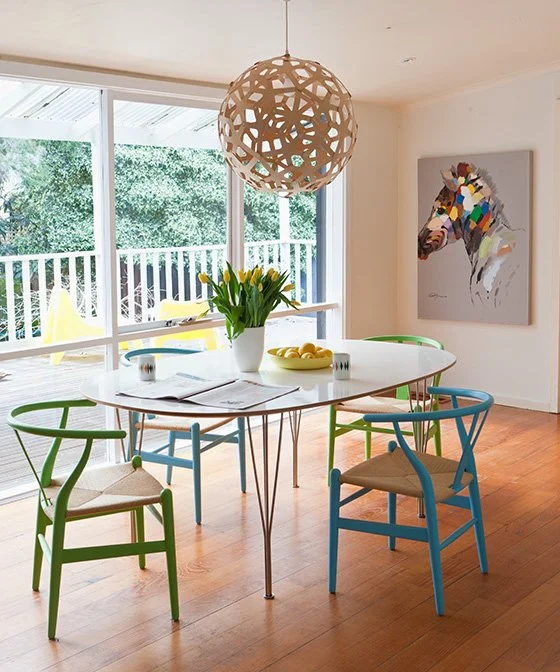
I’ve long admired New Zealand lighting designer, David Trubridge’s creations, so I was excited to finally own one of his Coral pendant lamps. It creates a striking focal point hanging over my Fritz Hansen dining table and looks magical at night, casting beautiful patterns around the room. I also incorporated this pendant into an scheme at one of my clients beach houses on the Mornington Peninsula, which was a resounding success. My green and blue Hans J. Wegner wishbone chairs bring colour to this space and echo the leafy shades in the garden.
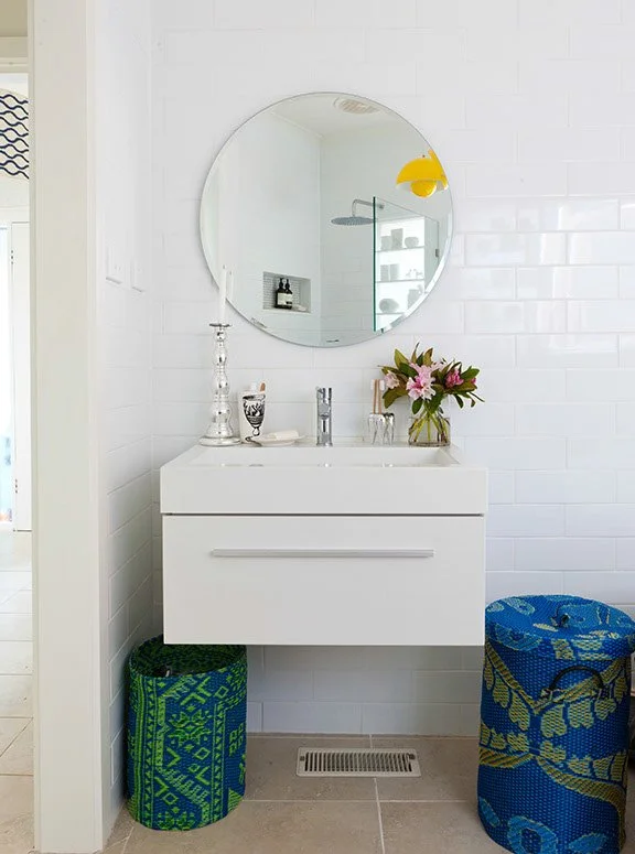
I chose a space saving wall mounted bathroom cabinet and paired it with a simple circular mirror to contrast with all the straight lines. The patterned laundry bins were made from recycled plastic mats and add interest to the pared-back space
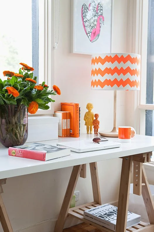
This is a detail of our home office with dual aspect windows looking out on to our dry-spell front garden. I’ve created an orange colour palette here with our hand painted Zig Zag shade, fresh marigolds from South Melbourne market, and a pair of African Clonette dolls, given to us by our friends at Tractor Home. The peacock screen print on the wall is by Nick.
Nicks portrait of our friend’s son, Kane, has pride of place in this corner of our sitting room. The painting evokes happy memories of our time spent in Flinders, a seaside town near Melbourne. Nick took a quick snap of Kane, as he tucked in to an ice-cream and perfectly captured Kane’s cheeky personality in this artwork using a combination of acrylic and spray paint. I bought this vintage 1950s chair, as a pair, at a local garage sale and recovered it in this zesty yellow green to tie in with the wallpaper.
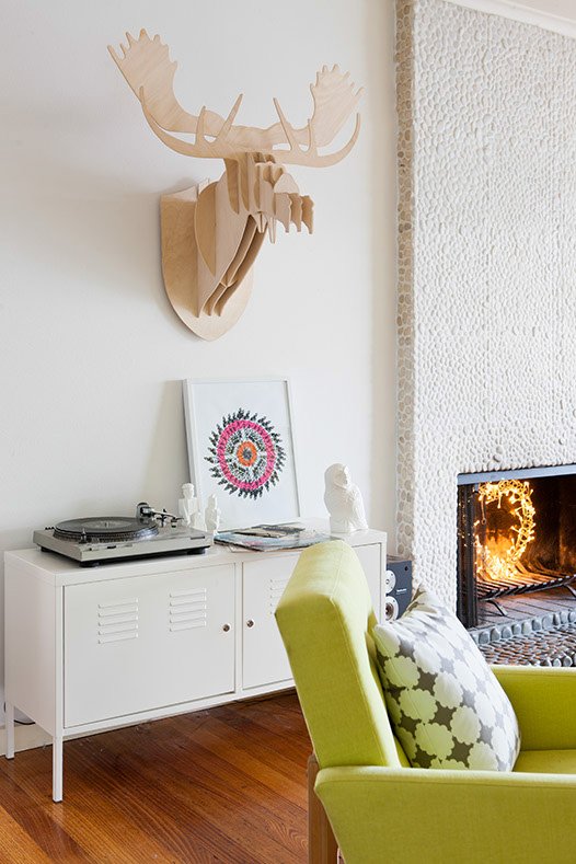
The textural pebble fireplace in the sitting room adds to the retro vibe and instantly creates a cosy atmosphere when the fire is lit in cooler months. I’ve hung the wooden moose head on the wall to play on the mountain chalet feel. For a splash of colour, I’ve propped Nick’s feather wheel screen print next to our record player on this cabinet.
The previous kitchen was very dated, and so I was keen to put my stamp on the space. When I first started thinking of ideas, I spotted a dreamy cornflower blue kitchen in Domino magazine, with chunky white worktops, and was drawn to its simple modern lines and fresh colour palette. We enlisted the help of a local kitchen company that had been recommended to us. On the day of the install the fitters raised their eyebrows when the saw the vibrant blue door fronts – not a common colour choice, but I was delighted with the end result. I’d wanted to feature Vivienne Westwood’s ‘Squiggle’ wallpaper for some time, so decided to have a huge drum pendant shade made for the kitchen to add a bold, unexpected element. (I also featured this iconic design on the walls of client, Claudia’s powder room in her beach house, which looked fab). Thanks to our late great, pupstar, Jack, for modelling. I think he was actually trying to speak here, and is probably trying to ask, ‘can I have my treat now?’
